Posts

Showing posts with the label typefaces

Writing, packing, babysitting

This Easter has been the Easter of church nursery duty. I didn’t get to hear any sermons. I didn’t get to tour the Stations of the Cross (not even the ones erected in my church’s sanctuary). I did get to hold some tiny babies.

It’s also been the Easter of packing books – into egg boxes, which is fitting. In two weeks, we’ll’ve moved into our new home.

What to do with the furniture? The couches, we’ll keep for now. The kitties have shredded them. They would shred any new couch.

Karin owns a heavy cedar chest. She just tried, with all her might, to raise its lid. Jasper took this as an invitation to jump onto the lid. Jasper involves himself in all our packing.

Ziva, though, is frightened by the packing. She hides under our bedcovers.

Now to abruptly change the subject: Recently, it’s become possible to use these Roman, Italic, and Bold fonts in Google Docs:

Bookman Old Style
Century Schoolbook
*Palatino Linotype
*Times (not Times New Roman)
Twentieth Century

(* denotes the availability of standard ligatures)

This makes Google Docs a better choice for writing papers. If I were to do grad school all over again, I’d use Google Docs, not LaTeX. LaTeX is a powerful free typesetting system, but the process of writing in code and compiling PDFs over a slow Web connection has swallowed up who knows how many of my most vigorous years.

A busy holiday in my chair

I had my Spring Break this week, and I made good use of the time, sitting at home in my armchair. I wrote and read and kept company with the kitties. I applied for one full-time job (the response, so far, has been perfunctory) and plotted to apply elsewhere. I wondered if I could get a scholarship to do research in Scotland. … Tonight I read Larissa MacFarquhar’s 2007 essay about Barack Obama. I typeset it into a handsome 13-page, 2-column PDF, using William Addison Dwiggins’s neglected font, ITC New Winchester. (The relevance is that this font is like Dwiggins’s Eldorado, and Obama’s maternal grandfather hailed from a Kansas town named El Dorado.)

Karin went to work each day and played video games each night. On Tuesday, we ate supper with our old pastor’s family, and, last night, we washed our clothes.

Karin has been trying to interest the kitties in their mirror reflections. Ziva is downright alarmed by hers. Jasper at first feigned indifference to his reflection, but tonight I noticed him perching on the bathroom sink, looking at himself.

Stephen’s speech

Obviously I was present at my own wedding, and I have some things to say about it. But for now here is the Best Man’s speech.
Before I begin, I would like to thank John-Paul for asking me to come here in front of so many people to do some public speaking. So: thanks, John-Paul.

As I was thinking about what to do today, I figured that I should just keep to the main purposes of the Best Man Speech. I came up with three.

The first, I suppose, is to provide some amusement or entertainment. It’s traditional, especially if the speaker is a brother, to bring up a funny story from the groom’s childhood or teenage years. Unfortunately, I am ten years younger than John-Paul. I either wasn’t around yet or I just don’t remember much about those times. I never saw him, e.g., when he would pick up cigarette butts from the street and try to smoke them. Nor do I remember when he would pray for ten minutes at a time to put off getting his shots. I never saw him when he was in grade school, where he was known to put on short plays he had spent hours adapting from Shakespeare. By the way, those plays were pretty good. I’ve read them.

My apologies for not being able to tell you more about when John-Paul was younger and, maybe, a little wilder? But no matter. I remember plenty about when he was older.

That brings me to the second purpose: I’m supposed to highlight some of the groom’s best qualities. Here is a sampling. John-Paul is an authentic person: he will always speak candidly to you. John-Paul is very intelligent and has an informed opinion on just about everything, even different types of font, which he is surprisingly eager to talk about. John-Paul is a person of great integrity: he won’t put up with any nonsense. John-Paul is very funny: in most of our conversations we have at least one good laugh. John-Paul is a voracious reader, and will be glad to give you some book recommendations, if you ask. John-Paul will always try to see the good in other people.

Finally, I am supposed to provide some reassurance about the matter at hand: the wedding. I remember one of the first times I saw John-Paul and Karin interacting together. It was during a pickup soccer game. If you know our family, you know that soccer is of great value to us. So when Karin started coming to our weekend pickup games just to watch him play, I really should have been clued in that something out of the ordinary was going on. Fortunately, John-Paul must have noticed because he started to brag about his leg muscles even more than usual. If Karin is willing to put up with that, then I know she must be someone special.

In all seriousness, we are glad the two of them noticed each other when they did. Their support and encouragement for one another has been evident for some time now, and we are eager to officially welcome Karin to the family. We are so happy for them, and we trust that God will guide their lives together.

R.I.P. Cruyff

The high school has installed a new computer in my office (the old one was put in in the ’90s). I was so delighted, I stayed at work even after I clocked out, to view the fonts.

♦ ♦ ♦ ♦ ♦

R.I.P. Johan Cruyff – arguably, the greatest soccer figure, ever. He was a patriarch of the Netherlands, of Ajax, and of Barcelona; a prescient strategist; a brilliant dribbler; and a Beatle-head.

He died of lung cancer.

♦ ♦ ♦ ♦ ♦

World Cup qualifier this afternoon. Ecuador vs. Paraguay, in Quito. Five o’clock U.S. Eastern Time.

On the one hand, we usually win this fixture, and lately the Paraguayans haven’t been very good.

On the other, we have a slew of injuries. Our front line is especially weak. Felipe Caicedo hurt himself recently in Catalonia. Miller Bolaños suffered a jaw-break in Brazil.

Énner Valencia returns after a long absence. But, everyone worries, is he truly fit?

Pray for Ecuador to win.

More fragments of April

Another month feebly chronicled. The epistle demanded my full attention.

I did send it in, last Thursday. That night, the Chairman of the Board replied that he would forward it to his fellow Trustees. His tone was friendly. He thought I was my uncle (a rather well-known figure at the College). I told him I was glad my letter would be read.

For some days afterward, I worried whether I’d chosen the proper font, but then I decided that I had.

♦ ♦ ♦ ♦ ♦

What with the springtime, the lawn is longer. It’s grown especially long over the spot where, last fall, we buried the mouse.

♦ ♦ ♦ ♦ ♦

One more day to finish this year’s book-reading. I’ve given up. (Next year, I’ll do better.) Lately, I’ve been reading essays about political libertarianism and conservatism. Here are belief-systems which depend on the most incredible historic claims. How to make these systems plausible? This challenge frightens off all but the boldest thinkers. I understand now why so many lifelong atheists study religion sympathetically, and why some of them convert.

A strange syllabus

One of my IU tutees brought in this syllabus.
Course title:  
  • Typography I.
Objectives: 
  • To develop an understanding of color theory, color relationships, and color terminology. [Uh, what.]
  • To develop hand and eye skills and technique for mixing and applying paint.
Texts and Materials: 
  • Color: A Workshop Approach by David Hornung.
Assignments: 
  • Various exercises on color theory and relationships.
  • Interpret an image using different color harmony schemes. [WTF.] 
Term Paper: 
  • Write a 10 page paper on a graphic designer/type designer of your choice. [Finally. No more of this color nonsense.]
[Etc., etc.]
I looked up “typography” in the dictionary and on Wikipedia to make sure I wasn’t going insane.

♦ ♦ ♦ ♦ ♦

Last week I was able to stay home in the mornings and work on my epistle, “Toleration at Bethel College.” About 50% of it is written. It’s time to crank up the speed. The trustees will vote on April 23.

April fragments

Alack/alas, only two entries for the month of March.

Also, I’m behind on my reading. My goal each year is to finish twenty-four books from May to April; this year, despite a rapid start, I’m stuck at twelve. As in most years, I’ll resort to reading Young Adult novels and a few very short, weightier works, e.g., A Psychological Study of Typography by Sir Cyril Ludowic Burt (Cambridge Univ. Press, 1959; xix + 57 pp) (requested from a storehouse at IU Bloomington).

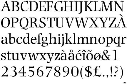
That book helped me to decide that Plantin is my favorite font. I’ll use Plantin in my letter to the trustees of Bethel College.

That letter is now a tome.

My spring break at IUSB was two weeks ago. My spring break at the high school will begin on Friday.

The activist

I’m writing a letter to the president and trustees of my old college, trying to persuade them not to fire teachers for refusing to teach (or to believe?) that the Bible contradicts the theory of evolution.

[*Sigh*]

This is my first time doing philosophy and social activism together. It isn’t easy. I’m not permitting myself to indulge these habits:

  • quoting (except from the Bible and the “Position Papers” of the denomination);
  • qualifying nearly every statement (my poor readers would never get through the whole epistle);
  • worrying about the font.

I wasn’t fine-tuned to be an activist.

If any of you fellow alumni are interested in this cause, let me know, and I’ll tell you some more details.

One surprise: my sympathy is growing for the anti-evolutionists. I think they may have a case. I mean, I still think they shouldn’t fire people, but I also think the anti-anti-evolutionsists owe them a concession. (Another reason I’m a lousy activist.)

A grand day off

Office-aide job A-OK.

Tutoring job old hat; still A-OK.

Dissertation not A-OK. (Old hat, though.)

♦ ♦ ♦ ♦ ♦

Along with the highschoolers, I have the day off, and so I want to use this empty moment to tell you to watch the first half of A.S. Roma vs. F.C. Bayern Munich, which was played last Tuesday for the UEFA Champions League. It was a fascinating first half. Not the prettiest first half I’d seen, but perhaps the awesomest one (and you know I never exaggerate). Bayern outscored Roma 5−0, and Roma weren’t even playing badly; Bayern were just that good. Their movements on the field were so intricate, so quick, I had trouble tracking them.

It wasn’t my favorite kind of soccer. It wasn’t effortless enough, and it wasn’t politically significant. It was astounding nonetheless.

The game should be available for a while on espn3.com.

♦ ♦ ♦ ♦ ♦

Today, out of love for Martin, I’m going to do some serious cleaning up. I’m going to clean up my bedroom, and I’m going to clean up the books that I’ve left stacked in the dining room. Also, I’ve lost my phone and I need to clean up the house to find it. Mary has the day off, too. Last night, she and I and Martin celebrated by going to the food court in the mall. We got into separate lines; I was counting out my quarters when Mary sneaked up behind me, put a five-dollar bill in my hand, and sneaked away. This melted the heart of the cashier, who tried to flirt with me. … Later, M&M and I went to Barnes & Noble, and though I didn’t have money to buy anything, I was able to look at the fonts.

Fraktur


I thought I’d return to the theme of Nazism. This is from Alexander Lawson, Anatomy of a Typeface:
The classifiers of type place all informal gothics under the French heading lettre bâtarde. … A. F. Johnson, the English expert on early types, prefers simply to use the term bastard, although the Latinized bastarda is more generally employed by historians. … 
By 1490 bâtardes were in wide use in Germany, where the name applied to them, apparently arbitrarily, was Schwabacher (there is no evident reason why the Bavarian town Schwabach was thus memorialized, as there was no typefounding or even printing at that location). 
Until the middle of the sixteenth century the Schwabacher style was what was most used for German-language printing; it was saliently used at Basel in Switzerland, then a center of scholarly printing. The next important bâtarde to be developed in Germany was the Fraktur design, which for the following four centuries served as the German national type. 
Fraktur is a more condensed letter than the Schwabacher, and varies from the earlier type in being more pointed, with sharply tapered ascenders; printers naturally had a fondness for this narrower form, which made the type more economical in book work. The design of Fraktur is credited to the Nuremberg calligrapher Johann Neudörferr, and at the request of Emperor Maximilian it was cut in metal for type in 1513. Within the next decade a number of other Frakturs were produced, and by the 1540s it was beginning to replace Schwabacher as the preferred letter for German printing. … 
In the long run it was the classical influence of the Renaissance that spelled the end of the prevalence that the gothic hands had maintained in northern Europe since the twelfth century. Only in Germany did it remain a convention, where it survived as a text type even into the twentieth century. Elsewhere, by the close of the eighteenth century black letter was being used primarily for headings and for specialized liturgical printing. In every other instance the roman letter forms had taken over the world of printing. 
Even in Germany, where Fraktur was the national type, the black letter has had a curious history. During the middle years of the nineteenth century, a great period of European nationalism, the use of Fraktur was inevitably strengthened — sufficiently, in fact, to offset the modernizing influence of the Industrial Revolution, particularly through the dominance of German technical and scientific literature. With the growth of international advertising in the early years of the present century, the use of roman type in Germany increased, but even as late as 1930 almost sixty percent of the new books being published were still composed in the German black letter (also called Deutsche Schriften), and almost every newspaper stayed with the Fraktur. 
When Adolf Hitler came to power, his National Socialist Party decreed that the Fraktur be considered the only appropriate form for the German language. This resulted in a wider use of Fraktur in the twentieth century than in earlier times. In 1940, however, it was officially determined that Fraktur interfered with the German plan of world domination, since outside Germany the roman forms prevailed. Thus, the Nazis then issued a proclamation that roman would henceforth be the German standard type, the explanation given being that Fraktur was a ‘Schwabacher-Jewish type.’ 
In postwar Germany roman has become the standard type, although with some difficulty, as the schoolbooks through which all adults had learned their alphabet were composed in black letter. But there is little likelihood that Fraktur will ever again be the national type; now less than one percent of German books appear in that hand. As a display letter, however, the face has been revived.

A new season

No tutoring this last week, but plenty of busyness: (1) attending meetings and turning in paperwork; (2) reading textbooks (and a few secondary sources); (3) writing essay prompts and syllabi.

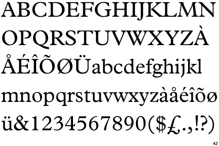
(2) and (3) have been pretty exciting. I chose each textbook because of its fonts. And I’m writing my IUSB course documents in Plantin and my Bethel documents in Photina.

Next week — Monday! — I’ll begin teaching. And during the nights I’ll be packing up my books to move out of my apartment. This has been a convenient but pricey place in which to live.

Where will I end up? I don’t know. Mary & Martin have offered to host me until I find somewhere better.

They just bought a house near Bethel. Their yard has a hot tub in it, with a large fence for privacy. Between the fence and the sidewalk, flowers grow out of a narrow strip of dirt. I told Mary & Martin to clear out the flowers and to plant tomatoes for public use: “Mishawaka Unity Garden.”

Along the eastern boundary of the yard is a noisy road. The western boundary nearly touches a power station.

Others might recoil, but I find the scenery quite charming. Industrialism, traffic: I am able to glean comfort from such things. I will miss the river, though. And it will be sad not to be able to walk so easily to my church.

April fragments


♦ ♦ ♦ ♦ ♦

What with recent rain, it seemed appropriate to watch The Ghost Writer. Much parodying: “Hatherton” is a parody of Halliburton; Pierce Brosnan is a parody of Tony Blair, of Ronald Reagan, of Bill Clinton, of George W. Bush, etc., etc.; Tom Wilkinson is a parody of Tom Wilkinson in Michael Clayton. There are jokes about Roman Polanski’s other movies and personal life. … But as I was saying, I watched The Ghost Writer because of the weather. The actors were always coming out of a downpour or enduring a drizzle, which made me feel cozy.

♦ ♦ ♦ ♦ ♦

Kenny’s gf Lara has moved to Indiana to be with him. They’ll be married at the end of June. Last night we went to the mall to try on dress shoes, and then on Lara’s lark we went into J Crew. For the first time ever, I felt ashamed to be underdressed. Note to self: avoid J Crew.

♦ ♦ ♦ ♦ ♦

Pickup soccer has been resumed, thank goodness.

♦ ♦ ♦ ♦ ♦

Speaking of being picked up, last week, at the bus station, I was standing on the patch of grass with the cigarette butts, minding my own business, when a black SUV with tinted windows crept up. The driver lowered his window; I stared (bad habit). The driver (middle-aged) said: “Want a ride?” I said: “No.” He drove away. At first I was like, doesn’t he realize I’m waiting for the bus? Then I was like, whoa.

Dreams

Happy Easter. At church-time I was in the nursery, distributing off-brand Rice Chex to the toddlers. I kept on yawning: “I’m tired.” They were skeptical. “Really,” I insisted, “I want to sleep.”

My night had not been restful. But I’d awakened after a nice dream: I was in Ecuador with my friends Brandon & Sarah; first I showed them my old dorm, and then the dorm changed into the soccer stadium. (In my dreams, I’m always returning to the soccer stadium.)

I also dreamed of Downton Abbey. Lady Edith had (clandestinely) been learning to smoke a pipe. She’d been practicing tricks, i.e. blowing smoke-rings. A visitor had discovered her doing this. “I daresay,” said the visitor, “you smoke better than I do.” Lady Edith batted her lashes at him and blew a smoke-ring. Of course the visitor was middle-aged, and of course he and Lady Edith began an affair.

I know, I know, people always think their own dreams are interesting when really they’re dull as dirt. Still, I’m rather proud of my Downton Abbey dream.

“The Semplica-Girl Diaries” is based upon a dream of George Saunders’s. It took him 12 years and 60 pages to build a story around that very simple dream. I didn’t like the story, but you can judge it for yourselves. At the mall’s Barnes & Noble with Stephen and Mary & Martin, I used up much willpower refraining from buying Saunders’s first story collection, CivilWarLand in Bad Decline. It’s typeset in Cochin, which is pleasurable to me (though I prefer URW Cochin because the italicized, lower-case s isn’t in cursive). We also ate in the food court and looked at forlorn, expensive pets.

February fragments

Last week I was sick. This week I feel better, but I’m still blowing my nose a lot. We’re out of tissues and I’ve switched to napkins (which, oddly, I prefer). I’ve gone running just twice — barely enough to keep limber. With sickness comes sadness, and sadness weakens my resolve to trudge through snow.

♦ ♦ ♦ ♦ ♦

At IUSB I tutored a professor. (He was from China; he needed help writing in English.) He was submitting an article for publication. The draft had been typeset with LaTeX, which made me nostalgic for graduate school.

♦ ♦ ♦ ♦ ♦

I’m conflicted about Libre Baskerville. On the one hand, well, it’s a Baskerville (or a Baskerville clone), and it has boldface and italics, and it’s free. I printed out a sample and it looked OK. I liked the tall x-height. On the other hand, I’m pretty sure the font was designed for webpages, not for print, and I don’t wish to be caught printing out the wrong kind of font.

♦ ♦ ♦ ♦ ♦

With Kenny I’ve been achieving domestic bliss: we’ve just finished watching Season 2 of Downton Abbey. But this weekend he’s in Nicaragua. With whom shall I watch TV? With Sabby, that’s whom. Five hours of Pride and Prejudice.

With David, two weeks ago, I watched Two English Girls. All we knew of it was its Hulu Plus synopsis: “A romantic triangle develops between two English girls and a Frenchman.” That seemed very promising to us. The movie fulfilled that promise.

♦ ♦ ♦ ♦ ♦

On the bus, an old lady asked to listen to my music, and so I lent her an earbud. She listened to “Cups” from Beaucoup Fish. She said it was the bomb.