Posts

Showing posts with the label Google

Body-text fonts, pt. 44: the Fell types

Abel now climbs stairs.

Too, too soon.

♦ ♦ ♦ ♦ ♦

Samuel has thought up a new Agatha Christie novel: Bossy (!).

“It’s about one man who kills another man in the Olden Days.”

♦ ♦ ♦ ♦ ♦

These fonts are available, gratis, from Google:

IM Fell Double Pica

IM Fell DW Pica

IM Fell English

IM Fell French Canon

IM Fell Great Primer

They’re digitizations, by Igino Marini, of types “bequeathed to the University of Oxford by John Fell in 1686.”

The fonts aren’t especially alike, nor do they work equally well for typesetting just any content. One must use them very judiciously. Their attraction is that they’re VENERABLE-LOOKING and ROUGH.

(DISTRESSED is another word that comes to mind, as in: “distressed blue jeans.”)

Even so, the fonts, when properly sized and spaced, are very legible.

Whenever I see them – or their doppelgängers (more on one doppelgänger in a moment) – it’s in some pretentious children’s book, e.g. The Assassination of Brangwain Spurge by M. T. Anderson and Eugene Yelchin.

(The story is charming; the pretentiousness is due to the number of pages.)


(Spurge, an elfin emissary to the goblin capital – and a spy – is hosted by a goblin scholar, Werfel, who tries his darnednest to be hospitable but can’t help committing faux pas.)

The font in this sample is actually a commercial font that looks like IM Fell Great Primer. It’s surprisingly OK as body text, isn’t it?

Just don’t go hog wild and use Fell fonts in all your documents.

Goodbye, hobbits

I finished reading LOTR and its appendices (spoilers follow). I reiterate: The book is excellent so long as the hobbits take center stage. The rest is fine if one already likes Beowulf and such; but I was glad when Mordor, Gondor, Rohan, and Rivendell finally dropped out of view and Frodo & Co. set about restoring peace and homeliness to the Shire, expelling the non-hobbits. (Ultimately, though, the four little heroes and old Mr. Bilbo would all depart to live out their days with elves or man-kings: some in the last chapter, others at the end of Appendix B.)

Karin doesn’t want to call our new son “Frodo.”

♦ ♦ ♦ ♦ ♦

Speaking of ol’ J.R.R., I also finished the fourth installment of Anthony Powell’s Dance to the Music of Time, and it occurred to me that we might not be living in some Wild West regarding when to put a space between a person’s initials; there might be a rule, after all. Dance features a character, J. G. Quiggin, a writer, whose initials are spaced when grouped with the surname and unspaced apart from it. So, on Quiggin’s books’ covers, the name appears as “J. G. Quiggin”; but his friends (or, rather, frenemies – he’s that sort) use the familiar unspaced “J.G.” Well, they say the letters out loud, but that’s how the narrator transcribes them.

This topic interests me because I’m sometimes referred to by my initials; although, because of the hyphen, the letters of my name shouldn’t ever be spaced: they should always be written “J.-P.” (Or “J-P” if the writer does without the periods.) I actually prefer “JP” – less fussy – but who am I to decide my own name and its cognates?

(Not that society has made up its mind on this. Trump’s running-mate’s homepage calls its subject “JD Vance,” but the Google search result says “J.D.” Wikipedia says “JD,” deferring to Vance’s personal preference. But I wonder if the editors shouldn’t overrule him. Isn’t that what Wikipedia is for? There’s the precedent of this book cover, too.)

Shopping

My Google Chromebook – cracked and dented after two years of harsh treatment (Samuel would use it as a stepping-stool, Daniel as an anvil/discus) – gave up its ghost yesterday, so I am blogging with my phone.

We trekked to Best Buy last night. The children gaped at the huge TVs. The computer salesman, who was urging an older couple to buy a higher-end device, may or may not have noticed us hovering (we were in his section some thirty minutes).

I cornered a worker from a different department. Sorry, he’s the only computer guy, he told me.

Amazing, I remarked to Karin as we left the store.

It’s been that way since COVID, she said.

Oh, dear.

I bought a refurbished machine through Amazon. It should arrive on Friday. Suppliers of refurbished Chromebooks receive very low ratings. The company I bought from has an approval rating of 88% – extremely high.

I don’t know how troubling this ought to be. A lot of “one star” raters complain, misguidedly, that they can’t install a Windows OS. How do you take off the Google, they ask.

One fellow quoted fire-and-brimstone verses, concluding: Vengeance is mine, saith the LORD.

Drafting today’s entry longhand before I tap it out may benefit the prose. Or not. Samuel is fascinated; never has he seen such long blocks of handwriting. He stares at the paper, draping himself over me, pinning down my limbs.

Daniel, who has removed his pants and diaper, races through the house.

Quino

Happy birthday, yesterday, to my dad. I spent a couple of hours at his house, along with Karin, Samuel, and Daniel. Stephen dropped by, too.

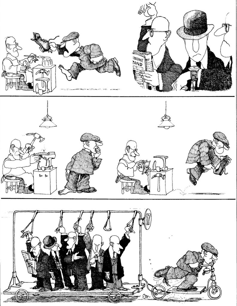
It turns out that my dad shares a birthday with Quino, the famous Argentinian cartoonist who died two years ago. If I had to rank newspaper comics in terms of, I dunno, some combination of intrinsic merit and life-impact, Peanuts would tower above all the others; and then would come Condorito, and then the gag comics of Quino. (I also grew up reading Quino’s daily strip, Mafalda, but was less taken with it.)

No niche-occupiers for me. I like my cartoonists to have hugely universal appeal.

Quino was just featured in a Google Doodle, throughout Latin America and in parts of Europe. I guess his appeal isn’t universal enough for the United States.

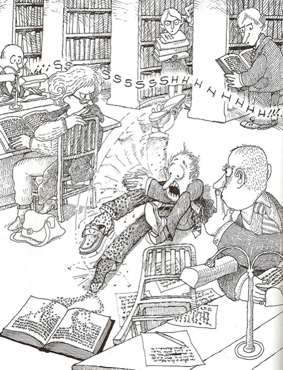
He isn’t a good caption writer. His best work is mostly wordless. Or it uses gibberish, as in this famous strip.

A few themes:

Owners.

Workers. (Uber, anyone?)

Politicians.

Law and order.

Reading/dreaming. (He is very good at drawing dreams.)

More reading.

Loneliness (one).

Loneliness (two).

Death (one).

Death (two).

The closest thing in this country is The Far Side. But Quino draws better, and with a certain grandeur.

Karin’s injuries; drawing; rolling over; body-text fonts, pt. 5: Charter

That longish stroll I mentioned last time was bad for Karin’s feet. She blistered them; then, unshoed at home, she cut her foot on the sharp edge of a bedframe. She sprayed her wounds, making them worse. She asked me to bind them. While I was doing this, Samuel got into the Band-Aid box (as is his way) and used up many Band-Aids. He asked me to put one on his wrist. He peeled it off and asked me to put it on him again. This was repeated many times. I’m not sure if he thought the Band-Aid needed to be attached just right or if he simply enjoyed having it come on and off.

He’s not averse to repetition – to practicing. This will serve him well in life.

He draws the same things repeatedly on his whiteboard. Or he asks me to draw. He never tires of looking at 2- or 3-D shapes. I tire of drawing them, though. One day, for novelty’s sake, I drew some foods – a pizza, a stick of broccoli, a banana – and gave them happy faces and hats. It was a mistake: Soon, Samuel was asking me to draw a happy eggplant and a happy daikon. I had to look up what a daikon is.

As usual, there’s less to say about Daniel, although I’m sure his little brain is quietly making even greater strides than Samuel’s right now. He continues to delight in everything (except when he doesn’t). Lately, he’s been rolling onto his belly, but not back the other way. He gets his arms caught under himself, which makes him panic.

♦ ♦ ♦ ♦ ♦

Now, the body-text font.

A descendant of Fournier, Charter is one of the most versatile serifed fonts. Matthew Carter designed it in the 1980s, for low-res. printing.

It looks good at any size. (Any visible size.)

It looks good on paper, on computer and phone screens, and on signage for the St. Joseph County Public Library (although, in this example, more space should have been put in between the majuscules).


I often see Charter in e-books and on blogs. I don’t see it in many printed books. Not that it looks bad in them. I own five books set in Charter. The bible from which I read in high school was set in Charter.

I like Charter in newspapers and magazines, although I don’t often see it in those media. I prefer it on rough paper, not glossy paper.

Bitstream Charter – the original design – is free. Of the free variants, my favorite is XCharter. Charis SIL, with glyphs in many languages, is available as a Google font.

Charter, or Charis, would work as body text in a Google Doc or a slide show.

In a better world, Calibri, Cambria, and Times New Roman would be less ubiquitous in draft documents; Minion would be less ubiquitous in publishing (especially in scholarly works with tiny print); and Charter would be the apathetic typesetter’s default font.

The Faroe Islands; anxiety; advice

I’ve mentioned that Un mundo inmenso is my favorite YouTube channel with videos about geography. Check out this lovely new video about the Faroe Islands:


These topics are discussed:
  • the underwater roundabout
  • Google “sheep” view
  • mail-order brides
I’d move my family to the Faroes tomorrow, if I could.

♦ ♦ ♦ ♦ ♦

I spoke to my doctor about the anxiety I’ve been feeling, and we agreed that prolonged isolation is taking its toll.

Get a part-time job, she said. When your wife returns from her job, go to a grocery store and stock the shelves.

Somehow, it didn’t occur to her that such an, ahem, solitary job would deprive me of what little contact I have with my wife.

I am reminded of how obtuse my well-wishers’ advice often seemed when I last felt such distress.

This time, the distress is not as bad; but it is bad enough. But here is one saving grace. Most every night, after I’ve talked with Karin and eaten supper and watched a little TV, I feel much, much better.

Woes

Most days, my students drop by unannounced, and I tutor them in the order in which they arrive. On Wednesdays, though, I tutor them by appointment. The disadvantage of the “by appointment” system is that I don’t get paid if a student cancels thirty minutes before the starting-time. (Moreover, when a student misses an appointment without canceling, I receive payment only for the first thirty minutes of the non-tutorial.)

Today, I met with one student at ten o’clock and with another at eleven o’clock. I worked with each student for one hour. Then I had lunch. All of that was OK.

Then, a student missed her one-o’clock appointment (she overslept, she later told me in an email). I obtained credit for thirty minutes of work. Also, because this was her second unexcused absence, I canceled her privilege to continue making tutoring appointments.

At 1:15, another student canceled her 2:00–4:00 appointment due to illness. At 3:30, the next student canceled his 4:05 appointment. (More illness – “the runs.”) And a little after 5:00, the last student called to reschedule her appointment (she’d had a workplace emergency).

So, although I was at the job longer than seven hours, I earned payment for about 2.75 of them.

It was similar two weeks ago. Wednesdays are generally pretty bad.

♦ ♦ ♦ ♦ ♦

Also, tonight, Elders Johnathon and Richard canceled the supper they were supposed to cook for us.

♦ ♦ ♦ ♦ ♦

Yesterday was pretty awful, too. I had to miss work for the draining of a trichilemmal cyst on the back of my neck. (If you want to see some disgusting photos, perform a Google search for the word “cyst”; my own cyst was much handsomer than those depicted.) The procedure hurt like hell. Afterward, I had to wear a very uncomfortable bandage.

When my surgery was over, I wasted much time at the Bureau of Motor Vehicles. I went there to update my ID card. After a long wait, my number was called, but I was told I’d failed to meet certain requirements for my objective.

During the wait, I reread a good chunk of J.M. Coetzee’s Life & Times of Michael K, the great South African novel of Kafkaesque misery. It got me feeling sorry for myself.

I decided that it might be funny the next time to bring along Kafka’s own stories to the BMV.

Austin, pt. 1: the outskirts

Though I’d known that Austin was hilly, I hadn’t expected so much of it to look like a gently undulating sea of trees – green trees mixed with scrubby, gray ones, sloshing over an occasionally exposed bed of brown-red soil.

David says the climate is Mediterranean, and I suppose that’s right. The air has been dry, the skies have been clear, and the temperature’s been in the fifties and sixties, Fahrenheit (in the summer, it’ll rise into the hundreds).

The buildings in Austin are incredible. Not beautiful: just very new, comfortable, and expensive-looking. Viewing them from the freeway, and now and then from regular city streets, I can tell that I’ll never be able to afford to live – or to work – in them.

Ana’s & David’s apartment near the edge of town is small but spiffy. Across the road is a private school that one of George W. Bush’s daughters used to attend.

We stayed near the outskirts yesterday (no downtown; no hipsters). David and Karin & I visited the zoo, all of whose animals had been “rescued.” My favorite animal was a gigantic Yorkshire hog named Babe. It was elderly and cancerous.

Then, we took a short hike to look out over the Pedernales River.

♦ ♦ ♦ ♦ ♦

In the evening, Ana joined us and we set out for the town of Marble Falls. We intended to visit the town’s cascadian namesake, as well as its state park and its legendary café, the Blue Bonnet, which is known for having a “wall of pies.”

We drove for an hour. When we reached the town, we found a pretty little lake and a city park, but no state park or falls. We asked Google to direct us. Finally, we came to a bit of cemented land with a distinctive topology of curved ramps and trenches, among which loitered some helmeted youths.

A sign proclaimed: “Marble Falls Skate Park.” Skate park, not state park. So much for that destination.

Next, we tried to visit the falls. This time, Google took us to the entrance of a gated residential area. A guard came out to meet us. We told her that Google had brought us there to see the falls. “Yes,” she said, “Google does do that. Unfortunately, the falls were covered over many years ago, when the dam was built.” (In 1951, we later learned.)

There remained the Blue Bonnet Café to visit. This, at least, existed, and regular diners already were queueing up to go inside. But our wait wasn’t long, our food wasn’t bad, and, afterward, we certainly ate a lot of pie.

Anniversary, pt. 2: Sheridan Road, Illinois; Milwaukee, Wisconsin; Google Maps

We chose Wisconsin because we thought the travel would be easy. It wasn’t. According to Google Maps, the House on the Rock – our final and most remote tour stop – lay less than five hours from South Bend. And yet our return took us nearly eight hours. Our rests were brief; our detours were minor; traffic in Chicago was relatively painless. Google just got it wrong.

Around 12:00 last night, we reached home and joyfully were reunited with Ziva and Jasper.

♦ ♦ ♦ ♦ ♦

The trip to Wisconsin was lengthy by design. In Illinois we kept to the Sheridan Road, hugging the lake. I wanted to see the mansions in Evanston, Kenilworth, and other obscenely rich towns. Then we drove through some merely well-off towns; through the grimy naval town of North Chicago; through Waukegan, where I’d lived as a three-and-four-year-old; and through Zion, where I’d spent the third grade. I showed Karin my old haunts (the fast food restaurants). We stopped at my old church, which now seemed very small, and I pointed out all my acquaintances in the photos on the missions bulletin board. We then went downstairs and interrupted a baby shower. I said hello to the pastor’s wife, who made me greet her husband on the phone.

Then it was north through dismal Kenosha and west to Milwaukee, where our goal was to eat some famous bratwurst. The bratwurst was so delicious and the pretzel so enormous, we’ll probably never eat at that place again (the food was felt well into the night).

The music inside the bratwurst pub was very loud. This distressed Karin, who’d never been inside any kind of pub. (She also was distressed when one drunk young man swung around and serenaded me with “Call Me Maybe.”) Traffic downtown in Milwaukee was bad. Parking was expensive. We called it a night and settled into our Waukesha Super 8. The TV was showing a marathon of Law and Order (the version with Lenny Briscoe and Jack McCoy).

Next entry: Madison, etc.