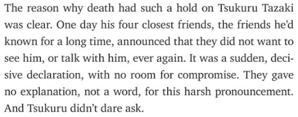
Karin’s injuries; drawing; rolling over; body-text fonts, pt. 5: Charter
That longish stroll I mentioned last time was bad for Karin’s feet. She blistered them; then, unshoed at home, she cut her foot on the sharp edge of a bedframe. She sprayed her wounds, making them worse. She asked me to bind them. While I was doing this, Samuel got into the Band-Aid box (as is his way) and used up many Band-Aids. He asked me to put one on his wrist. He peeled it off and asked me to put it on him again. This was repeated many times. I’m not sure if he thought the Band-Aid needed to be attached just right or if he simply enjoyed having it come on and off.
He’s not averse to repetition – to practicing. This will serve him well in life.
He draws the same things repeatedly on his whiteboard. Or he asks me to draw. He never tires of looking at 2- or 3-D shapes. I tire of drawing them, though. One day, for novelty’s sake, I drew some foods – a pizza, a stick of broccoli, a banana – and gave them happy faces and hats. It was a mistake: Soon, Samuel was asking me to draw a happy eggplant and a happy daikon. I had to look up what a daikon is.
As usual, there’s less to say about Daniel, although I’m sure his little brain is quietly making even greater strides than Samuel’s right now. He continues to delight in everything (except when he doesn’t). Lately, he’s been rolling onto his belly, but not back the other way. He gets his arms caught under himself, which makes him panic.
♦ ♦ ♦ ♦ ♦
Now, the body-text font.
A descendant of Fournier, Charter is one of the most versatile serifed fonts. Matthew Carter designed it in the 1980s, for low-res. printing.
It looks good at any size. (Any visible size.)
It looks good on paper, on computer and phone screens, and on signage for the St. Joseph County Public Library (although, in this example, more space should have been put in between the majuscules).
I often see Charter in e-books and on blogs. I don’t see it in many printed books. Not that it looks bad in them. I own five books set in Charter. The bible from which I read in high school was set in Charter.
I like Charter in newspapers and magazines, although I don’t often see it in those media. I prefer it on rough paper, not glossy paper.
Bitstream Charter – the original design – is free. Of the free variants, my favorite is XCharter. Charis SIL, with glyphs in many languages, is available as a Google font.
Charter, or Charis, would work as body text in a Google Doc or a slide show.
In a better world, Calibri, Cambria, and Times New Roman would be less ubiquitous in draft documents; Minion would be less ubiquitous in publishing (especially in scholarly works with tiny print); and Charter would be the apathetic typesetter’s default font.

