Body-text fonts, pt. 3: Melior
The mower is repaired, thanks to Karin’s dad; and the lawn is cut, thanks to me. And just in time, because this has been a rainy day.
On the whole, the weather has not been bad, but I haven’t wanted to go out strolling with Samuel and Daniel. I’ve been reluctant to take Daniel out very far: he’s still so small.
It’s not easy to think of good content for this blog when I don’t leave the house.
♦ ♦ ♦ ♦ ♦
This month’s font, Melior, was designed by the great Hermann Zapf.
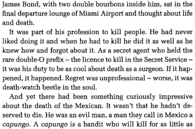
Speaking of Bond, I suppose the Russians are due to make a comeback as “the baddies” of spy fiction.
The reason is terrible, of course.
♦ ♦ ♦ ♦ ♦
Domestic terrorism is featured in British thrillers more and more often. Has this been true of U.S. thrillers? Of the Jack Reacher novels, for example?
It’s fun to read about agents who fight exotic foreigners. I imagine it would be less pleasing to read a thriller about, e.g., a homegrown mass shooter.